
Hiring teams collect more data than they did five years ago and still face unfilled shifts. In Korn Ferry’s 2025 survey of 750 senior HR leaders, 74% said their HR analytics capabilities are basic or descriptive only. The numbers get collected. The decisions still run on instinct and escalation.
Recruiters need a weekly funnel check, TA leaders a monthly read on cost and trend, and leadership a quarterly reset of the targets themselves. What follows is which metrics earn a place at each tier, and what happens when one moves the wrong way.
What are hiring metrics?
Hiring metrics are quantifiable measures of how a recruiting process performs across four dimensions: speed, cost, stage-to-stage conversion, and whether the hire starts and stays. Time-to-hire, cost per hire, application completion rate, offer acceptance rate, and first-90-day retention are the workhorses, and a stage-by-stage frontline funnel pairs one to each step it measures.
A metric earns its place only when a specific result changes a specific decision. If application completion dropping from 45% to 30% at one location triggers a form audit, that metric is doing work.
If the monthly report gets built, circulated, and filed with nothing happening downstream, the metric is decoration, and decoration is the most common state of hiring data. List every number on your dashboard next to the decision it is supposed to trigger, then delete the ones with a blank column.
Why frontline hiring metrics need different targets
Set frontline hiring targets by sector and location, because blended benchmarks and company-wide averages hide the differences worth acting on.
Segment the data three ways:
1. Segment by sector, because a national average was not measured on your roles
Median time-to-fill for nonexecutive positions is 39 days in SHRM’s 2026 recruiting benchmarking data, which makes a weak frontline target on two counts: it starts the clock when a requisition opens rather than when a candidate applies, and the sample deliberately oversampled vice president level and above.
Industry-segmented government data is the closer comparison. In April 2026, the seasonally adjusted quits rate was 4.0% in accommodation and food services and 2.7% in retail trade against 1.9% across all industries, a spread that tells a quick-service restaurant (QSR) operator more than any blended figure will.
2. Segment by location, because managers move the number more than markets do
When the CEO of a 238-store retail chain asked a randomly selected group of store managers to work on reducing quits, turnover in those stores fell by a fifth to a quarter and stayed down for roughly nine months. The baseline belongs at the location level, and a report naming the worst five sites tells you something a company-wide figure never will.
3. Segment by device, because mobile friction does not look like friction in a blended number
A funnel measured without a device split will label form abandonment as candidate drop-off, and the fix for those two problems is not the same. Pull last month’s completion rate by device and location, then read the mobile column against the desktop, site by site.
These cuts replace blended benchmarks with targets a site manager can actually be held to.
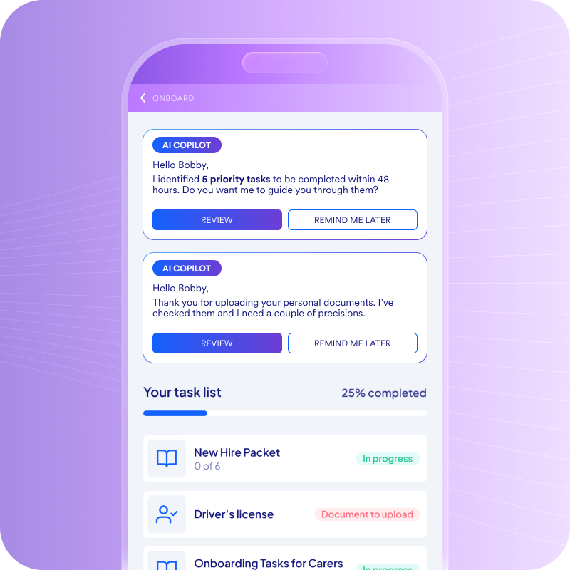
Faster ramp-up. Lower early attrition. AI onboarding built for speed, scale, and retention.
Top employers are already using Fountain’s Frontline OS to:
✅ Reduce turnover in the first 60 days
✅ Eliminate manual paperwork and task delays
✅ Accelerate new hire productivity with smarter workflows
Curious what smarter onboarding could unlock for your team?
Which hiring metrics to track, grouped by the problem you are solving
Metrics chosen by symptom beat metrics chosen by category, because a category tells you what a number is and a symptom tells you what to do next.
Four problems cover most of what goes wrong in high-volume hiring, and each has two or three numbers that localize it:
- When hiring is too slow, track time-to-hire, stage-level cycle time, and scheduling lag. Time-to-hire runs from application to accepted offer, and the overall number only confirms a problem exists. Stage-level cycle time shows where to investigate, and scheduling lag is usually the first place to look, because interview delays push candidates out before anything else does.
- When candidates disappear mid-funnel, track application completion rate, drop-off by stage and device, and offer acceptance rate. When completion falls, review application length and mobile usability first. Offer acceptance means something only against your own trailing quarter cut by location, and a drop there points at offer speed or off-market pay.
- When people accept and then do not start or do not stay, track Day 1 show rate and first-90-day retention. Measuring from Day 1 rather than the one-year mark keeps offer-to-start no-shows visible. Weak Day 1 numbers point at the offer-to-start interval; weak 90-day retention points at onboarding and scheduling, not recruiting alone.
- When cost is climbing, track cost per hire, cost per filled seat, and source yield. Cost per hire spreads spend across everyone you hired, while cost per filled seat charges it against the roles you needed covered, the more honest number when requisitions go unfilled. Source yield counts hires per channel, which stops volume from setting the budget.
Name which of the four problems you have this quarter and pull only those numbers. Applicants per posting, recruiter activity counts, and raw requisition volume wait until one of the four needs more detail.
Quality of hire needs judgment before it needs a formula. There is no universal quality metric, because the right measure depends on what the organization is optimizing for, and only 20% of organizations measure it at all.
ISO/TS 30411:2018 gives teams who want a formal structure a purpose, a formula, and a definition built to flex to business conditions. For frontline roles, the workable version is usually 90-day retention crossed with a supervisor rating, owned jointly by TA and operations.
Where hiring metric programs go wrong
Hiring metric programs fail in four predictable ways, and each one substitutes a convenient number for a useful one:
- Averages swallow the outliers you needed to see. Four locations filling roles in 9, 14, 22, and 51 days produce a 24-day average, even though the slowest takes more than five times as long as the fastest. Scale that to 200 locations and a handful of sites running 60-plus days disappear inside a company number nobody would flag.
- Volume metrics flatter the funnel when application counts stand in for outcomes. Applications measure advertising reach. Completion, stage conversion, and hires per channel measure hiring.
- Employer-side timing ignores the half of the clock the candidate is watching. Most dashboards time recruiter actions. When you investigate drop-off, look instead at how long candidates waited between stages and where they stopped responding.
- A national cost benchmark misleads when your own history is the better comparison. SHRM put average cost per hire at nearly $4,700 in 2022, a figure built across all employer sizes and role types. A frontline operation hiring 500 hourly workers a quarter has a cost structure that number was never meant to describe.
Use internal baselines cut by location and role, compared against last quarter rather than a national report. Rebuilding your dashboard’s headline numbers as a ranked list of locations is the fastest way to see what the average was hiding.
How to turn hiring metrics into a reporting cadence
The right numbers reviewed at the wrong frequency either drown the team in noise or surface problems after the quarter is already lost. Three tiers cover a frontline hiring operation, each with its own audience and its own decision, and one question sits underneath all three.
Weekly: funnel health for recruiters and site managers
The weekly review exists to catch candidates who are stuck right now. Stage-level aging, scheduling lag, interview no-shows, and completion rate by location expose a bottleneck while it can still be fixed.
It should run 30 minutes and produce one output: the list of stuck candidates and who unblocks each one. Anything a recruiter can act on inside a week belongs here, and anything they cannot belongs in a slower tier.
Set a stage-aging threshold in your applicant tracking system and have it alert on breach, so the review opens with a list rather than a search.
Monthly: trend and cost for TA leadership
The monthly review exists to move money and attention. Cost and quality metrics need a month of data before volatility stops dominating them, so time-to-hire trend, cost per hire, source yield, and offer acceptance belong here.
The output is a reallocation: spend toward the channels producing filled seats, attention toward the locations trending the wrong way. A monthly review that ends without a reallocation decision was a status meeting.
Read applications, hires, and cost per hire side by side per channel, because the channel with the most applications is rarely the one with the most hires.
Quarterly: revisit the targets themselves
The quarterly review exists to question the targets, not just the results. It compares hiring plan against actuals, reads 90-day retention and quality of hire, and asks whether the numbers still fit the labor market.
Targets set when applications were plentiful mislead once the candidate pool contracts. Reset them against your own trailing data by location, and read each location’s retention next to its speed, so a fast-hiring site with a 90-day problem does not keep its target.
When a number moves the wrong way, who decides?
Every metric needs a named owner and a pre-agreed response, written down before the number moves. A service level agreement with hiring managers is the usual mechanism: deadlines for candidate review, interview coordination, and final selection.
Stage-aging alerts catch a breach automatically and route it to the owner, but the routing is where the software’s job ends. The system flags, measures, and recommends. The named owner decides, and a program that quietly absorbs a missed deadline instead of escalating it is how averages hide problems for another quarter.
How Fountain measures and improves frontline hiring metrics
A weekly cadence only survives if a location-level answer costs minutes rather than an export and a queued analytics request. Fountain is Frontline Superintelligence for the frontline workforce, and it runs frontline hiring from a single orchestration layer called Cue.
An operator types “show me which locations are losing candidates before screening,” gets the breakdown by site and stage, and assigns the worst breakpoint to an owner instead of filing a report request.
Cue coordinates the agents that work the stages those metrics measure:
- Anna runs voice screening and interviews 24/7, which takes the slowest stage off a recruiter’s calendar.
- Emma answers candidate questions and walks new hires through I-9 and W-4 paperwork, so accepted offers turn into Day 1 starts.
- Sam collects post-hire feedback and surfaces retention risk inside the 90-day window. Recruiters and managers still approve offers and handle the exceptions that need judgment.
The metrics in this article land on the products underneath. The ATS carries the mid-funnel numbers through a mobile-first application and candidate self-scheduling, where completion rate and device-split drop-off get decided.
Onboarding tracks Day 1 readiness while the offer-to-start gap can still be closed. Sourcing reports cost per applicant and cost per hire by channel, which is the source-yield problem. CRM reactivates past applicants and former workers for seasonal openings without new spend, and Shift & Scheduling shows the coverage gaps that make a hiring number urgent.
Alto hired 450 drivers in 6 months with 3 recruiters, held time to offer to 2 to 7 days, and averaged $300 per hire, which is what capacity, speed, and cost look like read together.
The gap this article opened with was never a data gap. Teams have the numbers. What they lack is a named owner, a pre-agreed response, and a review that runs fast enough to matter. Wire those three to every metric you keep, and the dashboard starts changing decisions instead of documenting them.
To see that running against your own funnel, book a demo and watch Cue rank your locations by stage conversion, route a stage-aging breach to the site manager who owns it, and read Day 1 readiness next to 90-day retention.
Frequently asked questions about hiring metrics
What are hiring metrics?
Hiring metrics are quantifiable measures of recruiting performance across speed, cost, stage-to-stage conversion, and whether hires start and stay. Common examples include time-to-hire, cost per hire, application completion rate, offer acceptance rate, and first-90-day retention. The useful ones are tied to a specific decision that changes when the number moves.
How often should you review hiring metrics?
Weekly for funnel health, read by recruiters and site managers, covering stage aging, scheduling lag, no-shows, and completion rate by location. Monthly for trend and cost, read by TA leadership, ending in a decision to reallocate spend or attention. Quarterly for target-setting, where leadership compares plan against actuals and decides whether the targets themselves still fit the labor market.
Why don’t national hiring benchmarks match our numbers?
Because the methodologies and the labor markets differ. SHRM starts the clock when a requisition opens and oversampled senior respondents in its benchmarking sample, while platform figures measure application to hire inside a single system. Frontline sector quit rates also run well above blended averages, so industry-segmented government data is the closer comparison, and your own trailing numbers by location are the best one.